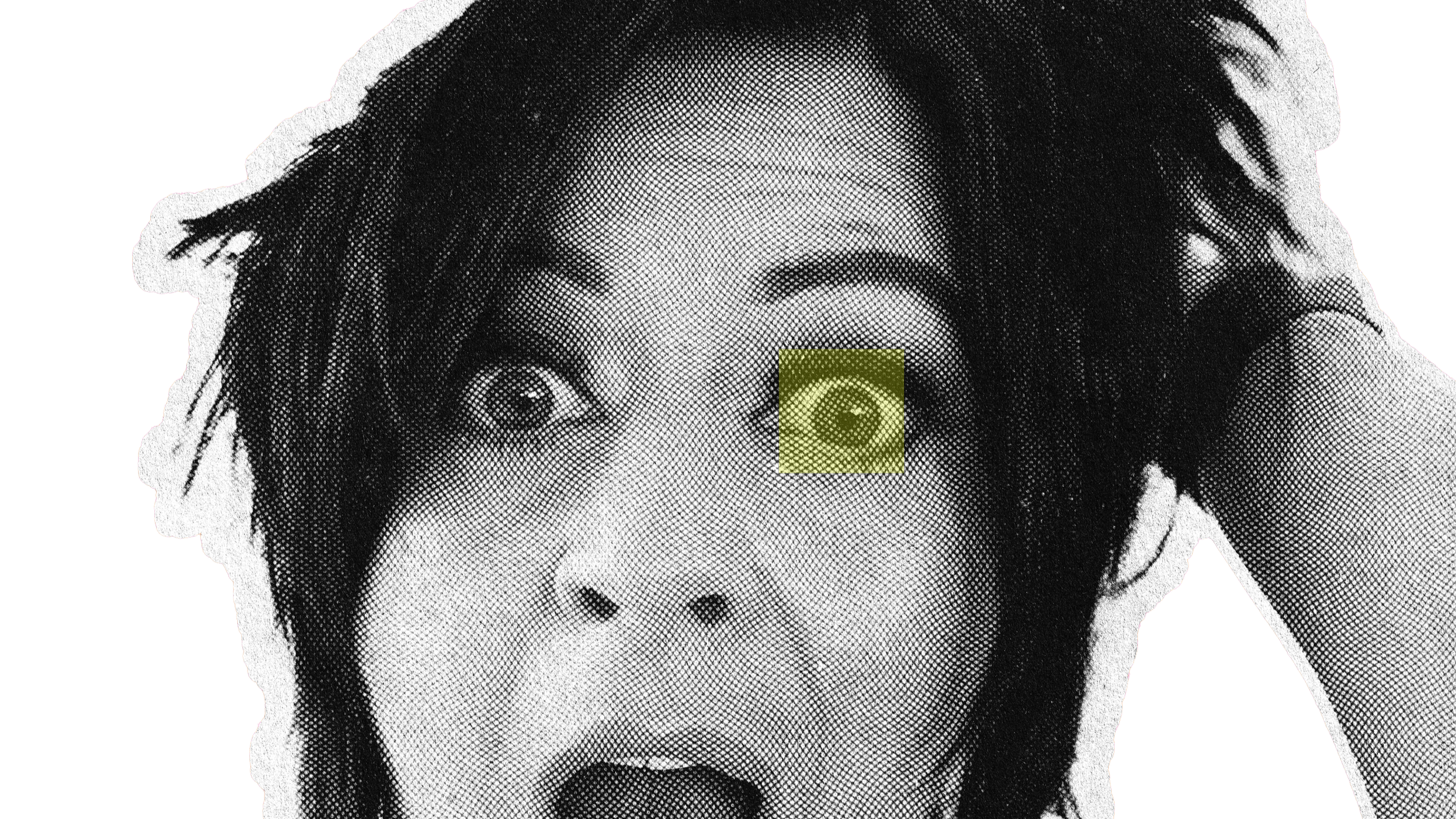
[studio]
Not a quiet studio.
A signal room.
Radcoast is led by Weronika — building brand worlds with atmosphere, edge and enough structure to make the chaos useful.
Controlled electricity. Luxury with a pulse.
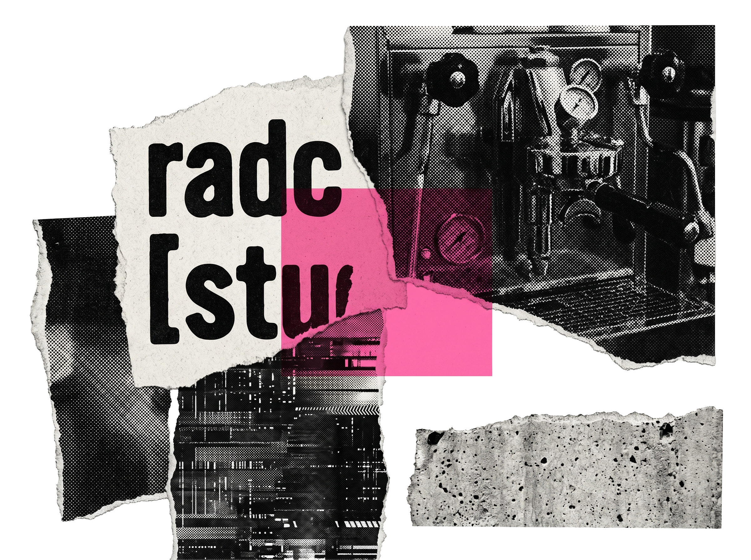
[the room]
Black coffee.
Concrete.
Neon after dark.
A little wrong in the right places.
Radcoast is shaped by contrast: clean systems, loud instincts, warm service, sharp taste and visual worlds that do not ask permission to be remembered.
Luxury with a pulse.
Not polish with no heartbeat.
[we reject]
NO FAKE LUXURY.
NO BEIGE SAMENESS.
NO EMPTY STATUS.
NO COLD PERFECTION.
A brand can look expensive
and still have no pulse.
NOT FOR EVERYONE / BUILT FOR PULSE / NOT BEIGE / ATMOSPHERE BEFORE ASSETS / NO DEAD BRANDS /
NOT FOR EVERYONE / BUILT FOR PULSE / NOT BEIGE / ATMOSPHERE BEFORE ASSETS / NO DEAD BRANDS /
Radcoast builds for atmosphere, recognition and movement - not polished little systems with no pulse.
[controlled electricity]
Energy with structure.
Rebellion with taste.
Emotion with clarity.
Controlled Electricity is the tension inside Radcoast: boldness with discipline, movement with purpose, confidence without noise.
Chaos is useful when it has a system.
![Text with the words 'radc' and '[stu]' in a bold, black font on a white background.](https://images.squarespace-cdn.com/content/v1/6801b3247114a5741065ccbc/f15d3ede-50f2-4c75-b1bd-fbafb203e023/Asset+1.png)
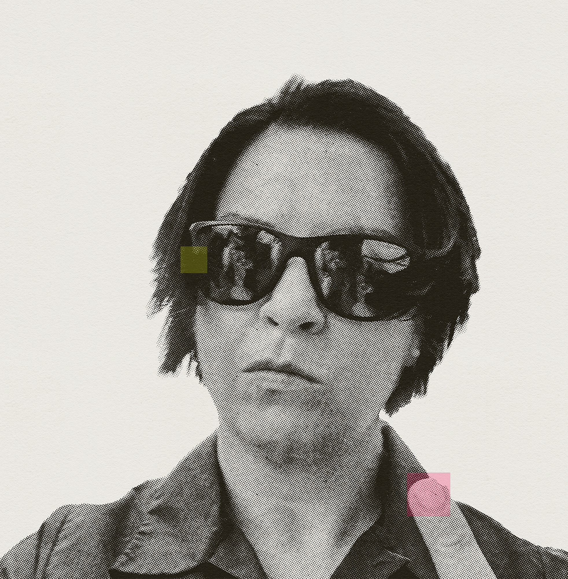
[weronika]
The eye
behind the system.
I’m Weronika, a brand identity designer building identity systems where energy, strategy and visual culture meet.
I help founders turn scattered energy into identity systems they can use across their website, content, launches and everyday brand touchpoints.
My work sits between strategy and atmosphere.
Not just how a brand looks.
How it enters the room.
How it is remembered.
How it moves.
I build the kind of identities people feel before they explain them.
[studio code]
The rules are simple.
01 / Atmosphere before assets.
If the feeling is weak, the visuals have nothing to hold.
02 / Recognition before decoration.
Pretty is not enough. People need cues they can remember.
03 / Structure before noise.
Bold only works when it has discipline.
04 / Edge before approval.
Trying to please everyone is how brands disappear.
05 / Movement before moodboards.
A brand has to survive outside the presentation.
A brand should not just look finished.
It should feel alive enough to move.
[open studio]
Ready to build
the world around your brand?
Bring the energy.
We’ll build the system around it.