SIGNAL
[radcoast studio]
GOOD DESIGN LOOKS GOOD. GREAT DESIGN MOVES PEOPLE.
Radcoast creates atmosphere-led identity systems for service-led brands — turning scattered energy into a recognisable visual world.
Energy-led. Not industry-led. Built for brands with a point of view.
[point of view]
Polish is not the point.
Recognition is.
A brand can look expensive and still feel dead.
Radcoast exists for brands that need atmosphere, not decoration. Identity, not just assets. Movement, not just moodboards.
WE REJECT
Beige sameness.
Logo-first thinking.
Pretty systems with no pulse.
WE BUILD INSTEAD
Atmosphere.
Recognition.
Visual worlds with spine.
Brands people remember.
ENERGY-LED / NOT INDUSTRY-LED / MAKE THEM FEEL SOMETHING / CONTROLLED ELECTRICITY / NOT FOR EVERYONE / BUILT FOR PULSE /
ENERGY-LED / NOT INDUSTRY-LED / MAKE THEM FEEL SOMETHING / CONTROLLED ELECTRICITY / NOT FOR EVERYONE / BUILT FOR PULSE /
[EIM™ method]
Energy.
Identity.
Movement.
EIM™ is Radcoast’s way of shaping brands that are felt first, recognised next, and remembered after.
01 / ENERGY
The first emotional signal. The atmosphere people feel before they understand the offer.
02 / IDENTITY
The shape, the voice and system that makes the brand recognisable.
03 / MOVEMENT
The momentum, created when people connect, remember and act.
[who this is for]
FOR BRANDS WITH
A SIGNAL PROBLEM,
NOT A TASTE PROBLEM.
Your brand might already look good.
That does not mean it is being recognised.
Radcoast is for brands with energy, perspective and ambition — but no clear system around it yet. The kind people can feel, remember and recognise across every touchpoint.
→
SIGNAL
- Looks polished, not remembered
- Nice visuals, no feeling
- Blends into moodboards
- Professional, not distinct
- Needs signal, not logo polish
- Clear creative direction
- Identity system w/ atmosphere
- Recognisable brand cues
- Messaging + voice direction
- Social/content styling
Recognition is not decoration.
It is a signal system.
[atmosphere]
A brand should feel like a world.
Not decoration.
Not beige.
Not dead.
[how we build]
How feeling becomes
a brand system.
A focused creative process that turns atmosphere, identity and direction into a brand system built to be recognised, remembered and used.
01 / DEFINE THE FEELING
We identify the atmosphere your brand needs to create before people understand the offer.
02 / SHAPE THE SIGNAL
We clarify what needs to be recognised first: your energy, your point of view, your offer and your visual cues.
03 / BUILD THE WORLD
We create an identity system, language and touchpoints that make the brand feel consistent and alive.
04 / MAKE IT USABLE
We turn system into practical assets your audience can understand, remember and act on.
[behind radcoast]
Built by Weronika.
Shaped by atmosphere.
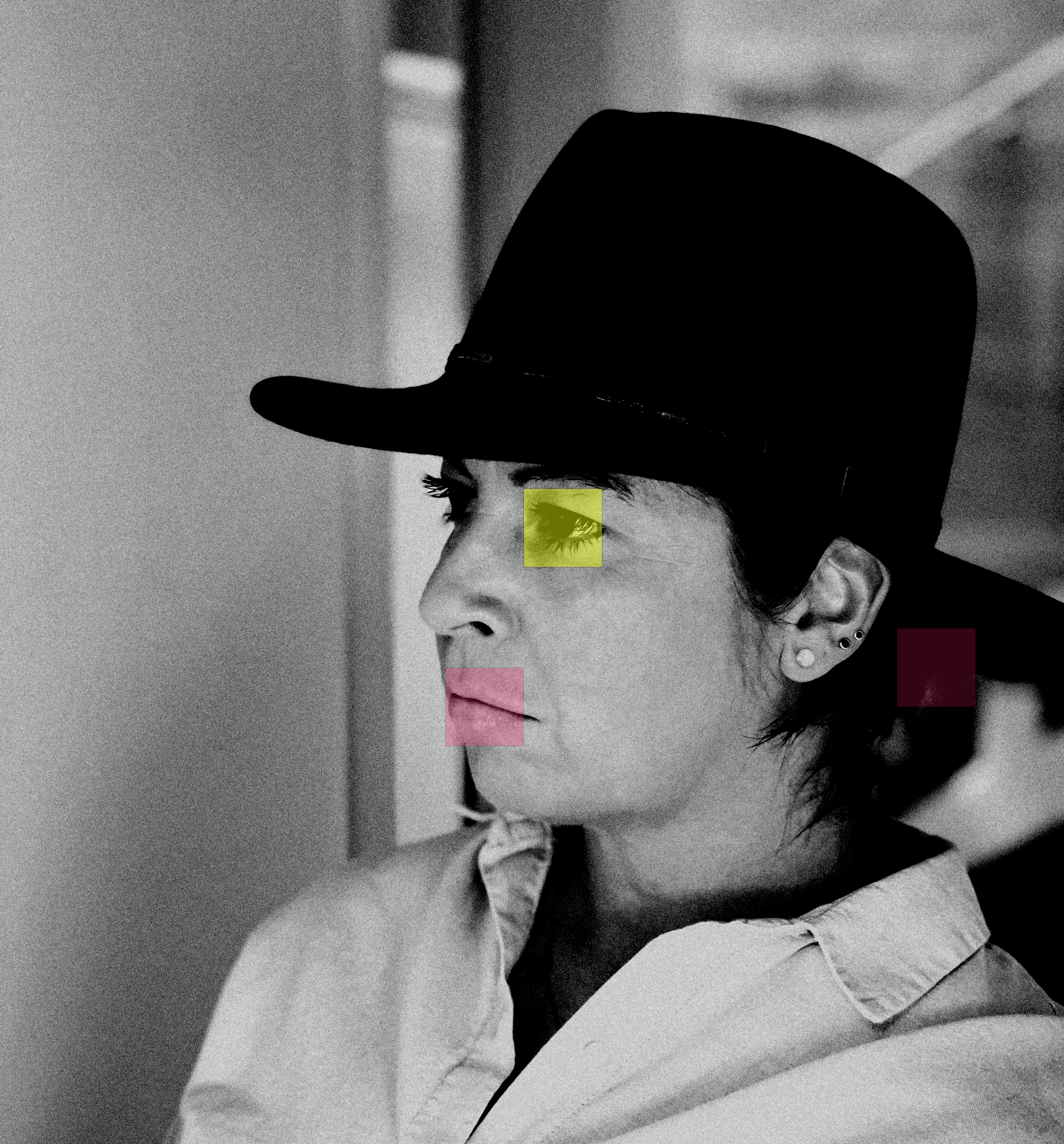
Radcoast is led by Weronika, a brand identity designer building systems where energy, strategy and visual culture meet.
The work is made for brands with pulse - personality-led, culture-aware, visually ambitious and ready for stronger recognition.
The system has a pulse because the person behind it does.
PROOF
[work]
Proof lives
in the work.
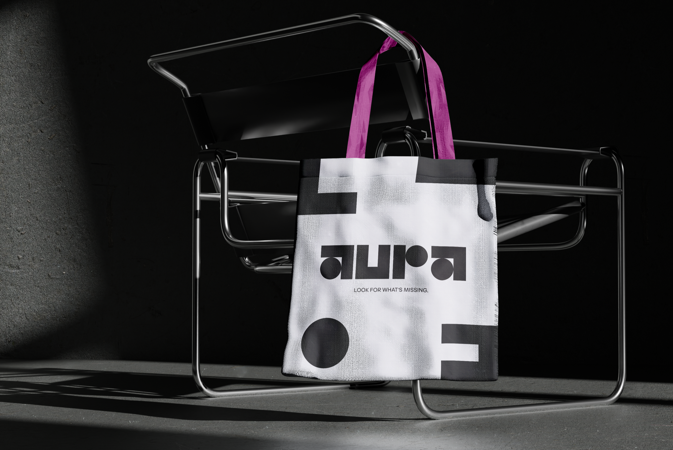
Not pretty slides. Not empty polish. Brand worlds with enough signal to be recognised.
[open studio]
Have something
with a pulse?
Bring the energy.
We’ll build the system around it.