Form & Force
strength with integrity.

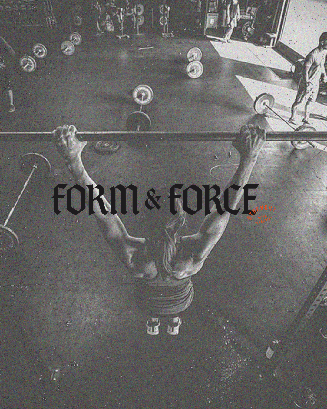
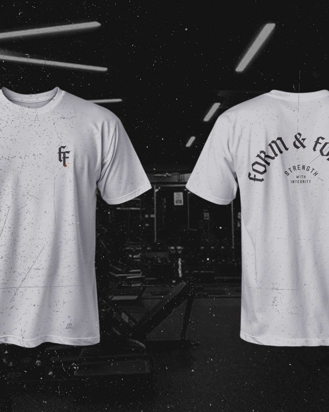
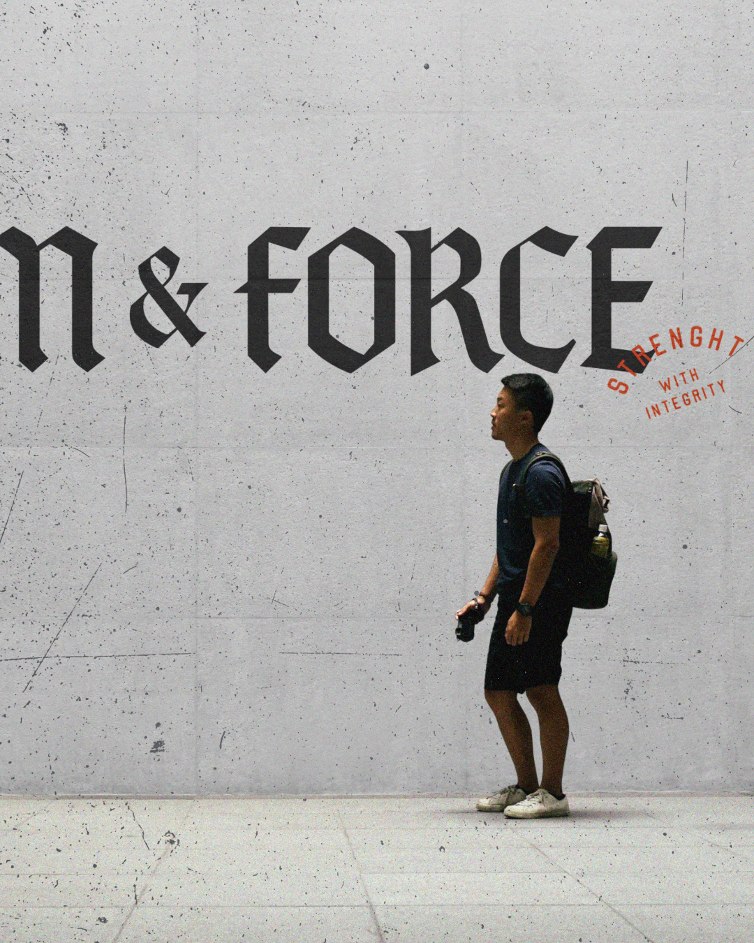
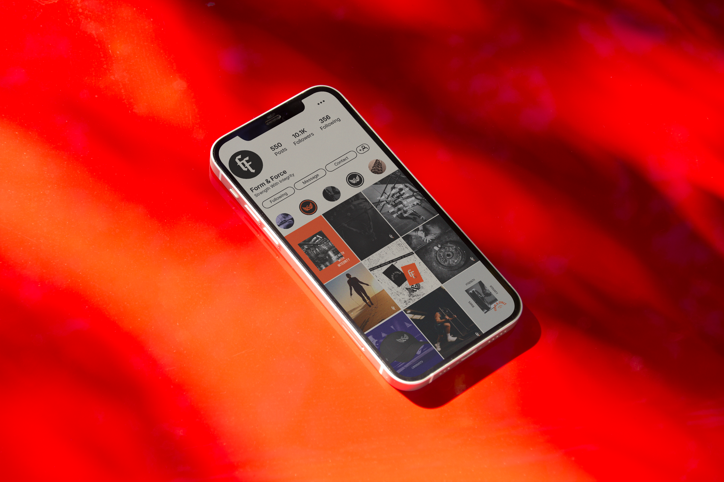
A full brand identity for Form & Force, built around strength, precision, and bold visual presence. The project included a complete logo suite, brand system, social media content layouts, campaign design, and merchandise applications.
The identity combines gothic-inspired typography, symbolic emblem design, and a dark, high-contrast visual language to create a brand that feels powerful, memorable, and culturally sharp. Designed to move across digital, print, and merchandise, the system gives Form & Force a distinctive presence with attitude, structure, and impact.
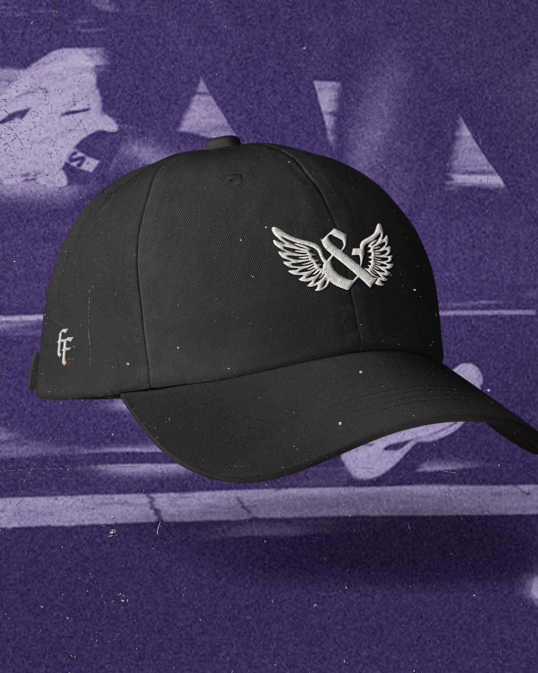
Service Provided: Branding / Logo Suite / Social Media Content Layout / Campaign Design / Merchandise
Client: Form & Force
Year: 2026
THE LOGO.

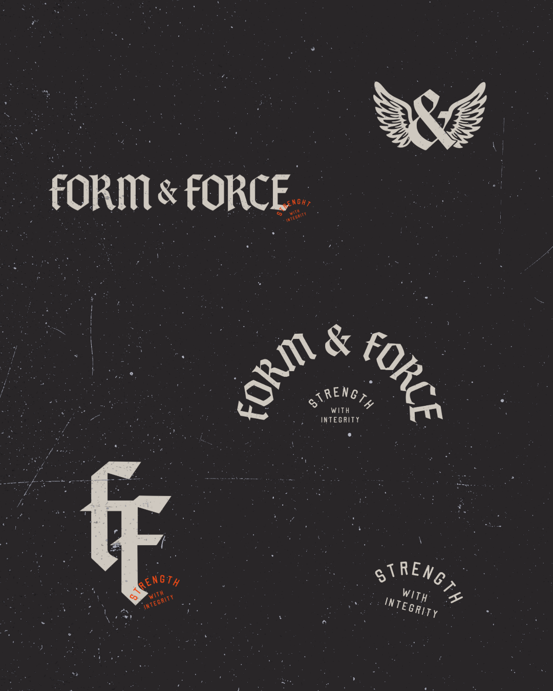
The main Form & Force wordmark uses a bold blackletter-inspired type style, giving the brand a strong, unmistakable presence. Its sharp edges, structured letterforms, and dramatic contrast create a feeling of confidence, heritage, and authority.
The wordmark feels both classic and contemporary — borrowing from historic gothic lettering while giving it a modern, streetwise edge. It positions the brand as strong, expressive, and unapologetic, with a logo that is built to command attention across brand touchpoints.
The typographic details give the logo its personality and distinction. The blackletter-style letterforms create a sense of craftsmanship, strength, and visual weight, while the sharp cuts and angular shapes add tension and attitude.
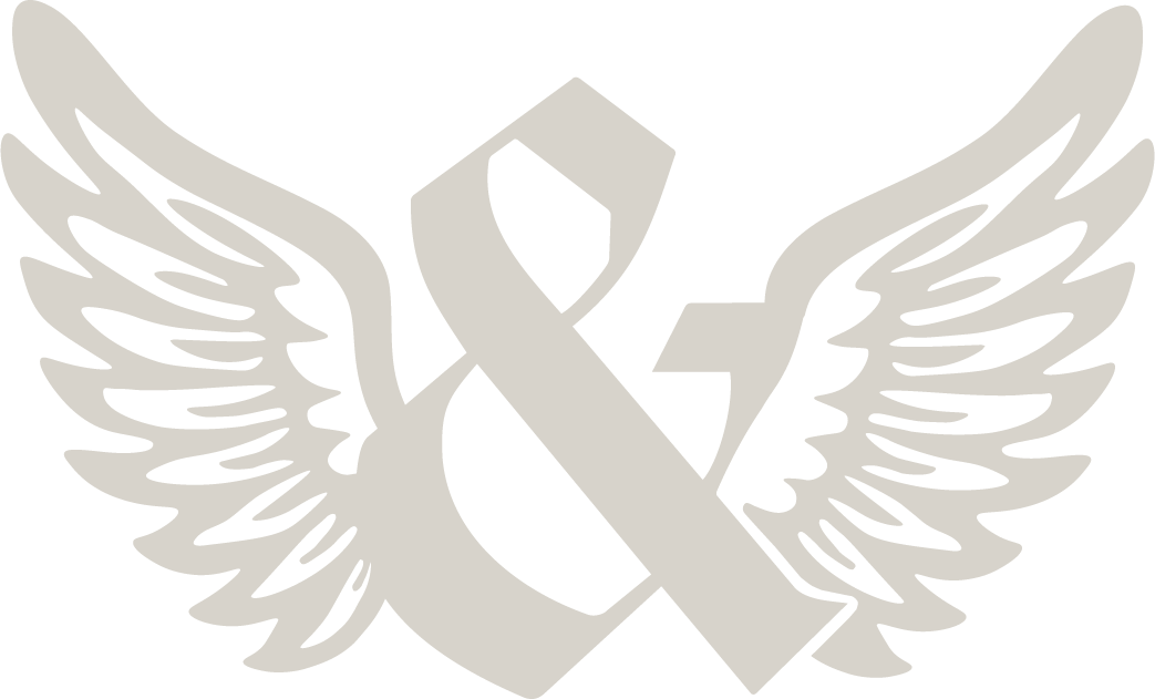
The ampersand acts as a central connector between Form and Force, balancing the two words and reinforcing the idea of contrast working together - structure and energy, discipline and movement, form and impact.
Together, the winged ampersand emblem and the Form & Force wordmark create a flexible logo system with strong symbolic character. The wordmark delivers recognition, authority, and structure, while the winged emblem adds movement, freedom, and an iconic badge-like quality.
The wings frame the ampersand as a symbol of connection and elevation, giving the logo suite a sense of energy and momentum. Combined with the gothic wordmark, the full identity feels bold, rebellious, and memorable - a visual system designed to stand out across social media, merchandise, campaigns, and branded materials.